Official stock photos of Alternity Nissan GT-R Convoy A-01 Ultimate Metal Silver edition and A-02 Vibrant Red edition.
LINK
I'm liking the bot mode pictures but the seams in the car mode are much more obvious in the smaller scale.
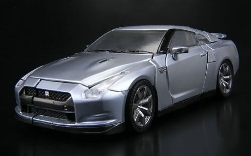
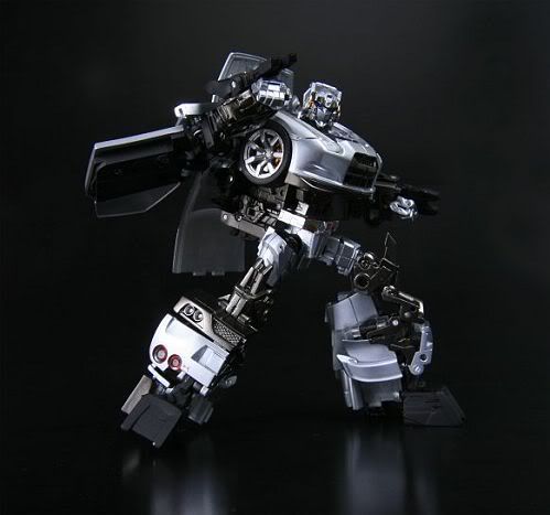
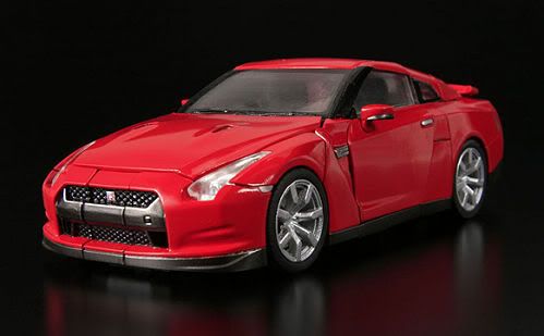
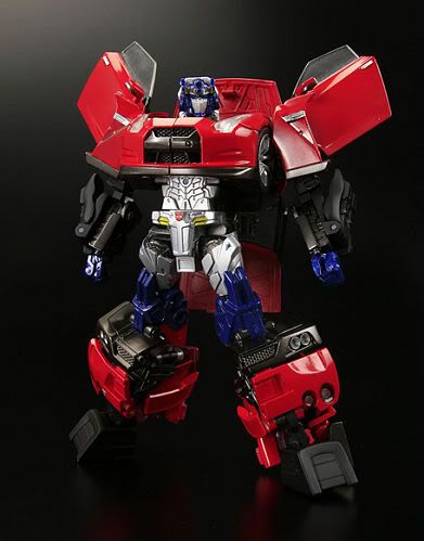
Official stock photos of Alternity Nissan GT-R Convoy A-01 Ultimate Metal Silver edition and A-02 Vibrant Red edition.
LINK
I'm liking the bot mode pictures but the seams in the car mode are much more obvious in the smaller scale.


Last edited by Tober; 26th September 2008 at 07:00 PM. Reason: Added pics
Which brings us to where we are today...
The silver one looks good. The red against the blue doesn't look right.
Good lord i hope this line continues past the initial release! I would love if they had creative license to use the GM models from TF2 and create these beautiful diecast transformers!
Yep, and I'm not liking the more obvious way his head is sitting against the silver on the red version. It ruins his iconic head profile and looks confusing.
Which brings us to where we are today...
Oh, I'm all over this! Red version is Gobot Optimus reincarnate.
Yeah, i think on both versions the plate behind the head is ruining the head profile a bit - would have been nice if it folded back out of the way completely. I guess there may or may not be a reason for that, i just want to have it in my hands and find out for myself! I'm really liking the small and subtle Autobot logo on the groin!
Now the Silver one doesn't look at all like Prime but it still looks damn!
At first impressions, the Red one is obviously meant to be Prime but IMHO it just doesn't work with the Alternity GT-R mould...
I like the variety of colours that the red one has, but I still prefer the silver.
Code:O o _ / -------------------------------- | IMMA FIRIN MA LAZAR!!! \_--------------------------------
I just can't get excited by this. While I understand the reasons why, the choice of Convoy just turns me right off. There are so many G1 characters which I would have found far more compelling. The red & blue colour scheme looks very forced.
Eagerly waiting for Masterpiece Meister