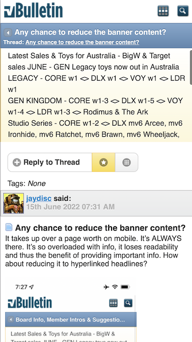
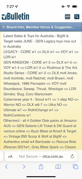
It takes up over a page worth on mobile. It’s ALWAYS there. It’s so overloaded with info, it loses readability and thus the benefit of providing important info. How about reducing it to hyperlinked headlines?


 Rank 9 - Board Staff
 Any chance to reduce the banner content?
It takes up over a page worth on mobile. It’s ALWAYS there. It’s so overloaded with info, it loses readability and thus the benefit of providing important info. How about reducing it to hyperlinked headlines?
Last edited by jaydisc; 15th June 2022 at 09:02 AM.
 Rank 6 - Dedicated Member
I always use the "view in desktop mode" button on my phone to fix the problem.
Rank 9 - Board Staff
Unfortunately, that proportionally reduces the font size of the content to an illegible size.Originally Posted by Deano85

Rank 6 - Dedicated Member
Yeah you have to zoom in like viewing a picture.
Rank 9 - Board Staff
Alas, all the benefit of the mobile layout is lost. However, this gives me a good idea. The banner could be programatically hidden (or reduced) only for mobile clients. I suspect the Bulletin allows custom CSS. This would HIDE the notices for mobile devices:
This would truncate it to 300 pixel (adjust as desired), but allow it to be scrolled:Code:.ui-mobile-viewport #notices { display: none; }
Looks like:Code:.ui-mobile-viewport #notices { height: 300px; overflow: auto; }
You might even be able to specify the truncation by line height (1rem = 1 line):Update: This doesn't work in this context
Code:.ui-mobile-viewport #notices { height: 3rem; overflow: auto; }Lastly, if it's going to be a scrollable viewport, you could turn off line-breaks, but that'll also have an adverse effect on readability.Update: This doesn't horizontally scroll properly on iPhones. I could possibly solve it, but I don't think it's a good solution.
I still maintain that the best solution is reducing the content, but I do not choose the priorities here. It's just a friendly recommendation.Code:.ui-mobile-viewport #notices { height: 3rem; overflow: auto; white-space: nowrap; }
Last edited by jaydisc; 15th June 2022 at 09:36 AM.
 Rank 8 - Deluxe Member
I've been blind to it with the non-optimised view on a mobile, but it's much tool large on the mobile-optimised view. I'd vote with hiding it on mobiles and leaving it visible for desktop only
 Posting Permissions

 Reply With Quote