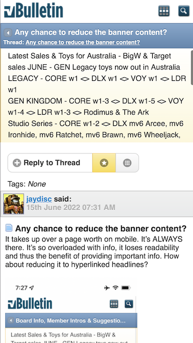
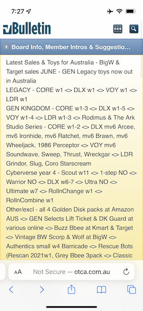
It takes up over a page worth on mobile. It’s ALWAYS there. It’s so overloaded with info, it loses readability and thus the benefit of providing important info. How about reducing it to hyperlinked headlines?


 Rank 9 - Board Staff
 Any chance to reduce the banner content?
It takes up over a page worth on mobile. It’s ALWAYS there. It’s so overloaded with info, it loses readability and thus the benefit of providing important info. How about reducing it to hyperlinked headlines?
Last edited by jaydisc; 15th June 2022 at 09:02 AM.
 Rank 6 - Dedicated Member
I always use the "view in desktop mode" button on my phone to fix the problem.
Rank 9 - Board Staff
Unfortunately, that proportionally reduces the font size of the content to an illegible size.Originally Posted by Deano85

Rank 6 - Dedicated Member
Yeah you have to zoom in like viewing a picture.
Rank 9 - Board Staff
Alas, all the benefit of the mobile layout is lost. However, this gives me a good idea. The banner could be programatically hidden (or reduced) only for mobile clients. I suspect the Bulletin allows custom CSS. This would HIDE the notices for mobile devices:
This would truncate it to 300 pixel (adjust as desired), but allow it to be scrolled:Code:.ui-mobile-viewport #notices { display: none; }
Looks like:Code:.ui-mobile-viewport #notices { height: 300px; overflow: auto; }
You might even be able to specify the truncation by line height (1rem = 1 line):Update: This doesn't work in this context
Code:.ui-mobile-viewport #notices { height: 3rem; overflow: auto; }Lastly, if it's going to be a scrollable viewport, you could turn off line-breaks, but that'll also have an adverse effect on readability.Update: This doesn't horizontally scroll properly on iPhones. I could possibly solve it, but I don't think it's a good solution.
I still maintain that the best solution is reducing the content, but I do not choose the priorities here. It's just a friendly recommendation.Code:.ui-mobile-viewport #notices { height: 3rem; overflow: auto; white-space: nowrap; }
Last edited by jaydisc; 15th June 2022 at 09:36 AM.
 Rank 8 - Deluxe Member
I've been blind to it with the non-optimised view on a mobile, but it's much tool large on the mobile-optimised view. I'd vote with hiding it on mobiles and leaving it visible for desktop only
 Rank 10 - Admin
I wasn't aware that the notices box was taking up so much of the screen for some people on their mobile devices. Whenever I web-browse on my phone I have it turned sideways so that websites look the same as on my computer (it doesn't compress the websites, and the font is often bigger and easier to read).
(I also didn't realise that the board is still defaulting for some people to the regular vbulletin blue/yellow colour scheme... I will have to see if I can get it to stay on its custom red/white/blue colour scheme.)
As for the notices box, it was created before mobile browsing was a big thing... and it was the result of being annoyed by people always asking if something had been released here - as it would have taken them longer to wait for someone to reply to their question than to just spend a couple minutes to look up the most recent sightings (or the checklist and first sightings topics when they were being kept up to date).
I will reduce it to just noting any toy sales, and the most recent new toy sighting as well as the most recent pre-order listing. That should limit it to just 3 lines of text on a phone browser. If we have a large number of new sightings at once I will just note the most fan-focused item.
Newest sightings and sales --- BigW, MYER & Target toy sales JUNE --- Out now GEN Legacy wave 1 & SS DLX mv6 Ironhide & mv6 Arcee --- Collab GIJoe Bumblebee & Yukikaze for pre-order
Last edited by griffin; 25th June 2022 at 05:30 PM.
Rank 9 - Board Staff
Rank 9 - Board Staff
I’m no longer receiving the mobile layout at all. Only desktop. Was it disabled entirely?
Rank 10 - Admin
I didn't change anything yet with the layout nor have I touched the mobile settings.
Can you select it from the drop down menu at the bottom of the page for "style chooser". Maybe it has switched over to the default non-mobile setting by accident. For computers it stays on the one that you select, even if you come back later and have auto-logged in, but I don't know if it would do the same for phones.
 Posting Permissions

 Reply With Quote