Possible, or give it some time. Maybe I'll get used to itOriginally Posted by griffin


 Rank 3 - Basic Member
Possible, or give it some time. Maybe I'll get used to it
 Rank 8 - Deluxe Member
yeah leave it for a while
 Rank 8 - Deluxe Member
 Rank 8 - Deluxe Member
The orange strips were part of the attempt to better integrate it with the underlying design. Since the banner floats over the background image you never know what part of it's over so I tried to use a tone that was about midway.
The border of the image was also drawn thin and in grey to match the gridlines, but it's not possible to quite line up the requested dimensions with the underlying pattern. Perhaps a bolder border might have worked better?
Rank 8 - Deluxe Member
I didn't find it jarring at all though. I suppose I've gotten used to banners being not directly colour related to the background.
I think having a primary white or black in the banner helps it match with pretty much anything.
 Rank 8 - Deluxe Member
Oh, I wasn't looking too deeply into it jus sayin i like g1 is allBut i'm hearing what you're saying. Maybe if the background was more of a cooler colour might help or the white ground was a little less.... white, It kinda reminds me of looking into a window , with the orange strips linking the left and right side of the background like part of a structure or a beam holding them back. I think it would be cool if the shot was more at ground level or a front-on perspective, like they were heading towards us and we could see shockwave's face..
You could always play around with the border anyway. Maybe make the border the same size and colour as the orange strips.
I didn't realize just how bright the colours of some of those g'1 were.
I'd like to see it in black and white or closer to it too. (maybe with glowing eyes or a glowing background so we just get there silhouette as they're walking away from an explosion.......or something to that effect
What is that effect btw?
I certainly couldn't do any better.
 Rank 2 - Distant Member
What if you had the banner go across the entire top of the page ?
Rank 8 - Deluxe Member
that could help with some of the contrast issues and if not might just be good for a change
 Rank 8 - Deluxe Member
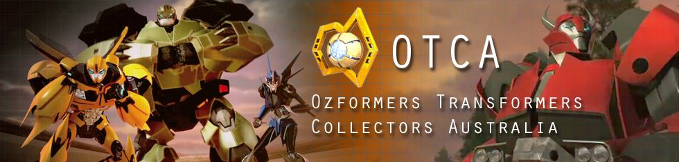
Got bored with HTML / CSS crap at work and decided to take a quite break and came up with this:
Banner available for download here: http://i141.photobucket.com/albums/r...CA_Banner7.jpg
I think we can move on from catering for 800x600 pixels screen size to a 1024x748 screen size now; thus the length of the banner.
~ JuzMel ~
My son is taking over all my TFs!
Rank 8 - Deluxe Member
Thats pretty cool
 Posting Permissions

 Reply With Quote