Lol at perpetually mistransformed official picsOriginally Posted by griffin


Yes
Only if....
No.
Not interested.
 Rank 8 - Deluxe Member
Lol at perpetually mistransformed official pics
 Rank 9 - Board Staff
It's sad isn't it? Any one of us could probably get it right...
Anyhoo, I have a vid review and some photos as well as thoughts on my blog
I have finally figured out why I wasn't so impressed with his Transformation. And this explains the same feeling I had for Cliffjumper as well. Due to the 'head reveal' gimmick, they have a solid chest, which features little to no transforming, so all you really transform are the arms and the legs.
I knew there was a reason (extra reason) why I preferred FE CJ over the normal one.
Oh and final plug, my unboxing video
Latest Blog Entries:
 Rank 8 - Deluxe Member
It is sad. But it's because Hasbro doesn't take those photos. They send toys to professional photographers who then transform the toys - usually correctly, but sometimes not - then photograph them and send them back to Hasbro... who accepts them.
Notice this happens far more infrequently with Takara. I suspect Takara must either:
1: use in-house photographers
2: if they use external photographers, those photographers may try to pay more attention to the instructions - mind you, Hasbro's instructions can be quite poorly illustrated which doesn't help
3: Takara rejects photos of toys that aren't correctly transformed and demand that the photographers do it again (and the photography company would lose face and feel ashamed/dishonoured that they haven't done their job properly)
 Rank 8 - Deluxe Member
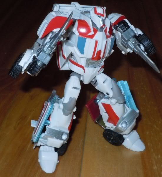
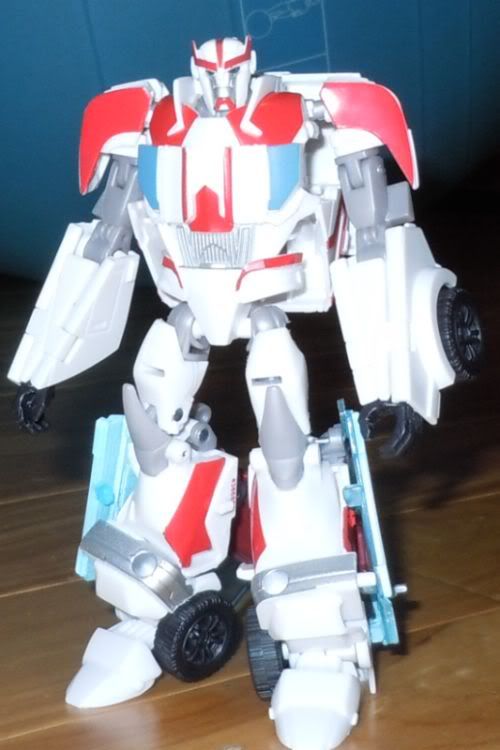
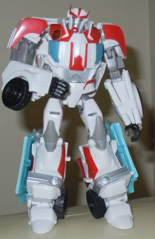
Ratchet's one of the those Transformers whose key selling point to me is the action figure style robot mode. I think he looks great in robot mode with nice shaping to the legs, chest and arms and a nice head mold. The weapons look good swapped in for his hands (although I'd only ever do this for one first). I don't know the cartoon character so I'm projecting the IDW Ratchet's persona onto the toy (and it generally fits well although IDW Ratchet would have a happier expression). The vehicle mode is not as nice, and I can understand the complaints about paint apps in that mode. But in robot mode, the use of red, white and grey is just about right and the robot mode is the winner here.
Rank 8 - Deluxe Member
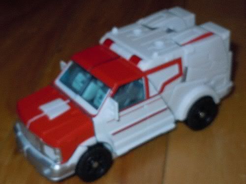
Better than I expected, but it is a very white toy and would benefit from more reds to break it up. The rear part of the vehicle mode is unpainted and looks unfinished.The lack of any emergency vehicle markings (i.e. cardiopulse) in vehicle is annoying, and the lack of any Autobot insignia is downright unforgivably frustrating.
I know some people complained about TakTOM's TFP Arms Micron toys coming with stickers, but I would much rather this toy come with an Autobot logo sticker than with nothing at all!
The weapons are super soft, much like FE Voyager Optimus Prime's sword. While there could be more red paint apps, they are done well where they exist. The greys also work fine, and there are nice silver apps on the face and bumper which also helps to off-set the whites on the shins and belly.
I thought that only TakTOM's Ratchet had the two holes on the roof... I thought it was an add on for the Arms Micron, but Hasbro's has those holes too, which makes the vehicle mode look a bit unsightly. And considering that Ratchet comes with a pair of blades, I can't imagine why he would need to stick them on the top of his roof. Unless he wants to drive right between a large Decepticon's legs and slice open their... ya know.
Pics!
I tried to carefully peel off the small Autobot logo from my G1 Emergency Ratchet toy and transplant it onto TFPRiD Ratchet, but of course, whenever you peel off a sticker that's already been applied for ages, it ends up creasing and damaging the sticker. Some of it came off the backing, so I had to glue it back down. *sigh* Better than nothing I guess... I really should order some reprolabel insignias in case Hasbro releases more toys in the future without logos (I shouldn't have to... Hasbro should do their job right...
 Rank 8 - Deluxe Member
Looks good, I can't wait to get hold of this guy.
I see what people are saying about the paint apps on the back, especially with respect to the heartbeat insignia. I think it might be a compromise between robot and vehicle modes since the back of the van make up his forearms.
I have seen a couple moded ratchets, sorry no links right now, where they have added the heartbeat sign and it's split around the forearm in robot mode.
the CG model has solid red there, and the solid red would look terrible on the back of the van. perhaps leaving it white is an overall more acceptable look for both modes.
Rank 8 - Deluxe Member
I can understand why the forearms can't be totally red -- but I wouldn't mind broken up red from the pulse insignia. That would be acceptable to me. It would certainly look no worse than some of the random red bits on Wheeljack!!
And the lack of any paint apps on the back of the vehicle (e.g. tail lights/indicators etc.) looks really drab -- and difficult to understand/justify considering that there's no paint apps for the pulse insignia or Autobot logo. Often toys will lack paint apps in one area because of a design feature or extra paint app somewhere else -- and Ratchet has a sparse paint job and his only accessories are two really soft rubber knives. I can't imagine where, with the budget money that's saved from sacrificing these logos... unless it's that "automorph" head gimmick... but I find that hard to accept considering that we have many other Deluxe figures with better paint jobs and some kind of gimmick. :/
 Posting Permissions


 Reply With Quote