
Originally Posted by
Deano85

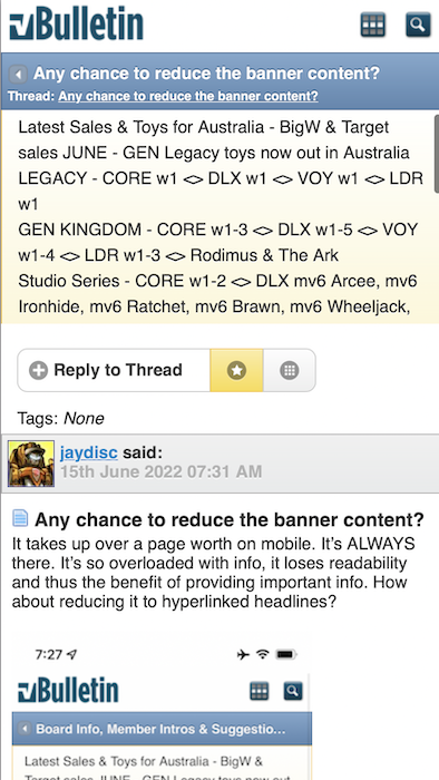
Yeah you have to zoom in like viewing a picture.
Alas, all the benefit of the mobile layout is lost. However, this gives me a good idea. The banner could be programatically hidden (or reduced) only for mobile clients. I suspect the Bulletin allows custom CSS. This would HIDE the notices for mobile devices:
Code:
.ui-mobile-viewport #notices {
	display: none;
}
This would truncate it to 300 pixel (adjust as desired), but allow it to be scrolled:
Code:
.ui-mobile-viewport #notices {
	height: 300px;
	overflow: auto;
}
Looks like:
You might even be able to specify the truncation by line height (1rem = 1 line): Update: This doesn't work in this context
Code:
.ui-mobile-viewport #notices {
	height: 3rem;
	overflow: auto;
}
Lastly, if it's going to be a scrollable viewport, you could turn off line-breaks, but that'll also have an adverse effect on readability. Update: This doesn't horizontally scroll properly on iPhones. I could possibly solve it, but I don't think it's a good solution.
Code:
.ui-mobile-viewport #notices {
	height: 3rem;
	overflow: auto;
	white-space: nowrap;
}
I still maintain that the best solution is reducing the content, but I do not choose the priorities here. It's just a friendly recommendation.


 Reply With Quote