


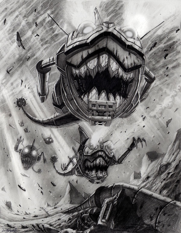
Those Sharkticons look awesome. I like the look of some of his art.Originally Posted by Sam
 I think his style is not for everyone.
I do not like his art in the IDW TF comics, but Ramondelli demonstrates a strong understanding of the relationship between lighting and shading, backed by traditional core skills such as the use of pencil to denote texture, as well as the ability to compose images that draw the eyes to desired "reads".
If you check out his pencil drawings, hopefully you will see what I mean:
Sharkticons: http://livioramondelli.deviantart.co...cons-137824775
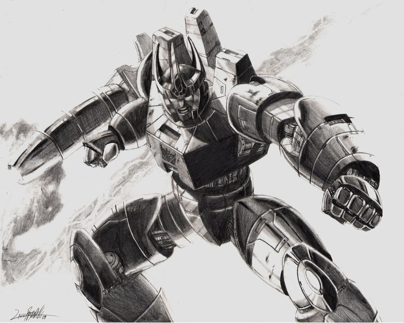
Galvatron: http://livioramondelli.deviantart.co...tron-123720279
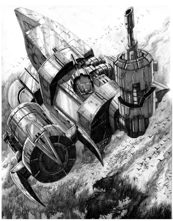
Omega Supreme: http://livioramondelli.deviantart.co...reme-148406049
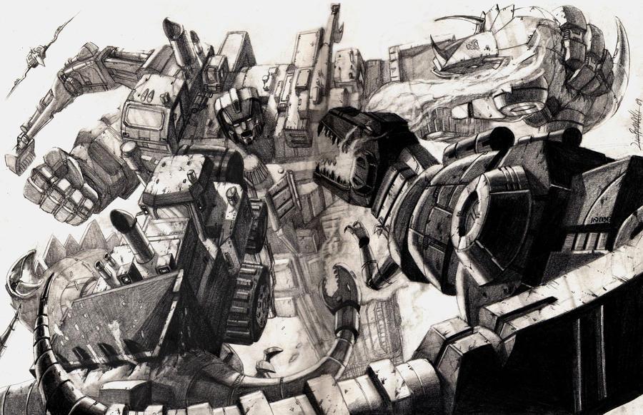
Devastator vs Dinobots: http://livioramondelli.deviantart.co...bots-121601861
coloured version: http://livioramondelli.deviantart.co...olor-122339865
For some reason, I feel the quality of his style is lost when placed in the TF comics. I can't quite put my finger on it, but I believe it's definitely not due to his skills as an artist.
That said, although I admire his skills and enjoy his artwork, my favourite artist when it comes to Transformers still has to be Don Figueroa (http://donfig.deviantart.com/gallery/).

 Reply With Quote


