Page 2 of 3 FirstFirst 123 LastLast
Results 11 to 20 of 22

Thread: Seibertron interviews Livio Ramondelli

  1. #11
    Join Date
    23rd Sep 2010
    Location
    Sydney
    Posts
    9,352

    Default

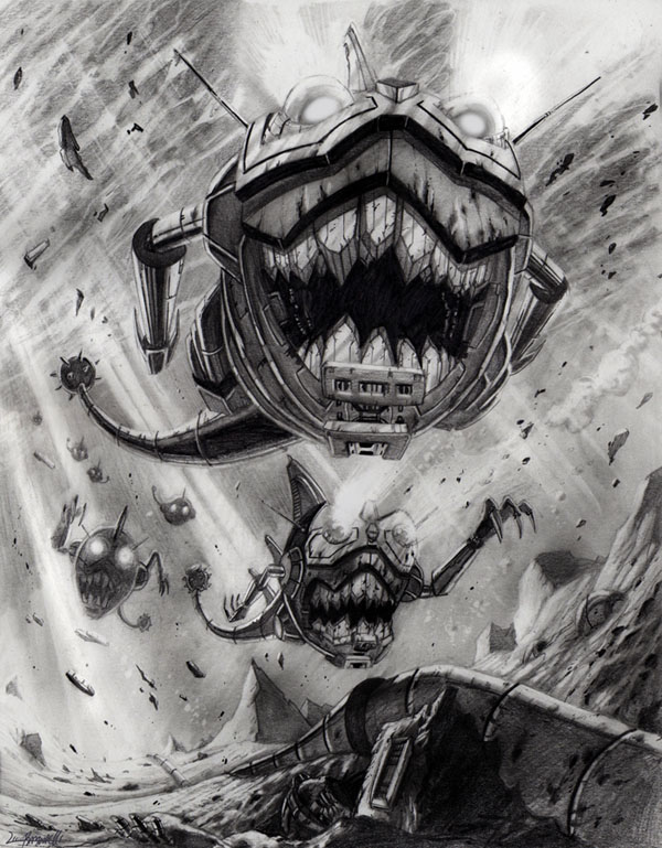
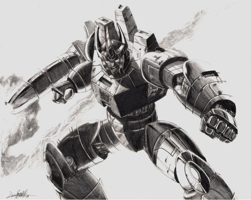
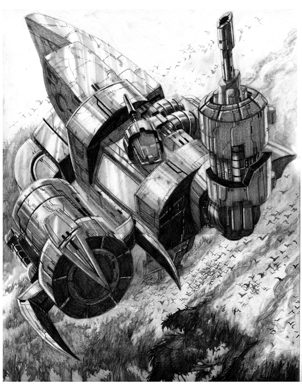
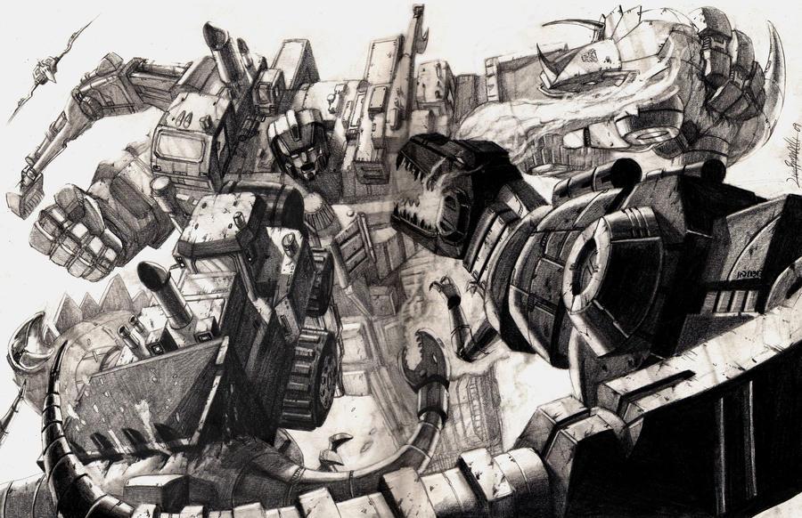
    I don't mind it in the right situation. it works well for the dead universe visuals but I feel it's too gritty and too much to have as a continuous style. It worked well for the Junk Planet panels in Monstrosity.

    I can see why people have an issue with it. I tend to not like "messy" art in my comics, I much prefer clean lines and well defined edges. A lot of his work looks like it would be great before the "grit" filter is applied.
    My Fan interview with Big Trev

    my original collection from when I was more impressionable.
    My Current Collection Pics (Changing on occasion)

  2. #12
    Join Date
    8th Nov 2012
    Location
    Melbourne
    Posts
    2,122

    Default

    Quote Originally Posted by UltraMarginal View Post
    A lot of his work looks like it would be great before the "grit" filter is applied.
    I still find his general character stances/looks and all, still just don't fit well. Everyone has a weird skewed/stretched/unproportional look. I'm exactly the same as you though, I prefer clean lines and well defined edges as well. Especially for Transformers. I find his work is maybe to Horror like?

  3. #13
    Join Date
    23rd Apr 2009
    Location
    Ballarat
    Posts
    728

    Default

    His art is great. It's perfectly fine for the series and has brilliant atmosphere, if a little murky in some panels. His line work is fantastic. Strong figures, great detail. I'm not sure I really get the 'messy' criticism. It's always seem very clean to me. I'd certainly rather have on a book than, say, Wildman.

    I'd love to see someone else colour his work, just to see how it looks, not because I think he's bad at it (I haven't actually read the interview yet, so I just assume he colours his own work), just because I think then it would really pop.

    I really disagree with him about it being just like the G1 cartoon though. That makes no sense to me.

  4. #14
    Join Date
    1st Jan 2008
    Location
    Sydney
    Posts
    2,327

    Default

    I think his style is not for everyone.

    I do not like his art in the IDW TF comics, but Ramondelli demonstrates a strong understanding of the relationship between lighting and shading, backed by traditional core skills such as the use of pencil to denote texture, as well as the ability to compose images that draw the eyes to desired "reads".

    If you check out his pencil drawings, hopefully you will see what I mean:

    Sharkticons: http://livioramondelli.deviantart.co...cons-137824775


    Galvatron: http://livioramondelli.deviantart.co...tron-123720279


    Omega Supreme: http://livioramondelli.deviantart.co...reme-148406049


    Devastator vs Dinobots: http://livioramondelli.deviantart.co...bots-121601861
    coloured version: http://livioramondelli.deviantart.co...olor-122339865


    For some reason, I feel the quality of his style is lost when placed in the TF comics. I can't quite put my finger on it, but I believe it's definitely not due to his skills as an artist.

    That said, although I admire his skills and enjoy his artwork, my favourite artist when it comes to Transformers still has to be Don Figueroa (http://donfig.deviantart.com/gallery/).

  5. #15
    Join Date
    24th May 2007
    Location
    Brisbane
    Posts
    38,239

    Default

    So he's like the Michael Bay of comics - he can do great promo action shots, but is hard to watch a whole issue in that style.

  6. #16
    Join Date
    2nd Jun 2011
    Location
    Rylstone
    Posts
    8,386

    Default

    I thought his artwork quite suited Autocracy and Monstrosity and did not mind it at all there. Sometimes the proportions are out (Scorponok is huge, but then Hun-Grrr in beast mode is just as tall, that should mean Hun-Grrr is the size of Broadside in robot mode!) and sometimes it is dark but I thought it really worked for these two series.

    That said however his artwork in all the other TF comics has really not appealed to me at all and I would have to say he has been one of my least fav TF comic artists.

  7. #17
    Join Date
    27th Dec 2007
    Location
    Chadstone, Vic
    Posts
    15,772

    Default

    Damn those black and white drawings are excellent.

    I was having a flick through Chaos last night and there are some gorgeous panels and pages in there. Don't have hard copies of the digital-first stories yet.

    Overall I like his art, but for comics the storytelling is not great and his colouring does tens to make everything too dark. There are less appealing artists doing TF art, so i like this for being something different.

  8. #18
    Join Date
    23rd Apr 2009
    Location
    Ballarat
    Posts
    728

    Default

    Quote Originally Posted by BigTransformerTrev View Post
    I thought his artwork quite suited Autocracy and Monstrosity and did not mind it at all there. Sometimes the proportions are out (Scorponok is huge, but then Hun-Grrr in beast mode is just as tall, that should mean Hun-Grrr is the size of Broadside in robot mode!) and sometimes it is dark but I thought it really worked for these two series.
    Expecting scale in Transformers media leads to madness. Even MTMTE isn't perfect in that regard.

  9. #19
    Join Date
    23rd Sep 2010
    Location
    Sydney
    Posts
    9,352

    Default

    That art is really nice Sam, but that highlights what i find as blurry in the Monstrosity series.

    what you showed there is really excellent, it feels to me there is a filter that's applied somewhere between the original art and the final coloured inked images that takes out a lot of the sharpness and adds almost a grainy scratched texture. so much of the initial detail is lost.
    My Fan interview with Big Trev

    my original collection from when I was more impressionable.
    My Current Collection Pics (Changing on occasion)

  10. #20
    Join Date
    8th Jun 2012
    Location
    Melbourne
    Posts
    5,306

    Default

    Quote Originally Posted by Sam View Post
    I think his style is not for everyone.

    I do not like his art in the IDW TF comics, but Ramondelli demonstrates a strong understanding of the relationship between lighting and shading, backed by traditional core skills such as the use of pencil to denote texture, as well as the ability to compose images that draw the eyes to desired "reads".

    If you check out his pencil drawings, hopefully you will see what I mean:

    Sharkticons: http://livioramondelli.deviantart.co...cons-137824775


    Galvatron: http://livioramondelli.deviantart.co...tron-123720279


    Omega Supreme: http://livioramondelli.deviantart.co...reme-148406049


    Devastator vs Dinobots: http://livioramondelli.deviantart.co...bots-121601861
    coloured version: http://livioramondelli.deviantart.co...olor-122339865


    For some reason, I feel the quality of his style is lost when placed in the TF comics. I can't quite put my finger on it, but I believe it's definitely not due to his skills as an artist.

    That said, although I admire his skills and enjoy his artwork, my favourite artist when it comes to Transformers still has to be Don Figueroa (http://donfig.deviantart.com/gallery/).
    Those Sharkticons look awesome. I like the look of some of his art.
    Seeking the Following:
    - CW Brawl
    - Earthrise Runabout
    - Earthrise Thrust

Posting Permissions

  • You may not post new threads
  • You may not post replies
  • You may not post attachments
  • You may not edit your posts
  •